Flame Case Study
Project Overview
For my UI specialization course through CareerFoundry, I designed a responsive web fitness app, Flame.
Context
Getting into an exercise routine can be daunting for many people, especially those of us who have no working knowledge of gym equipment or limited fitness know-how. Additionally, finding routines that fit into our jam-packed schedules is tough. Therefore, the goal of Flame is to motivate people of all experience levels to get into a fitness routine customized to their schedule, skills, and interests.

My Role
- UI Designer
Timeline
- 8 weeks
Tools
- Figma
- Balsamiq
The Design Process
Define
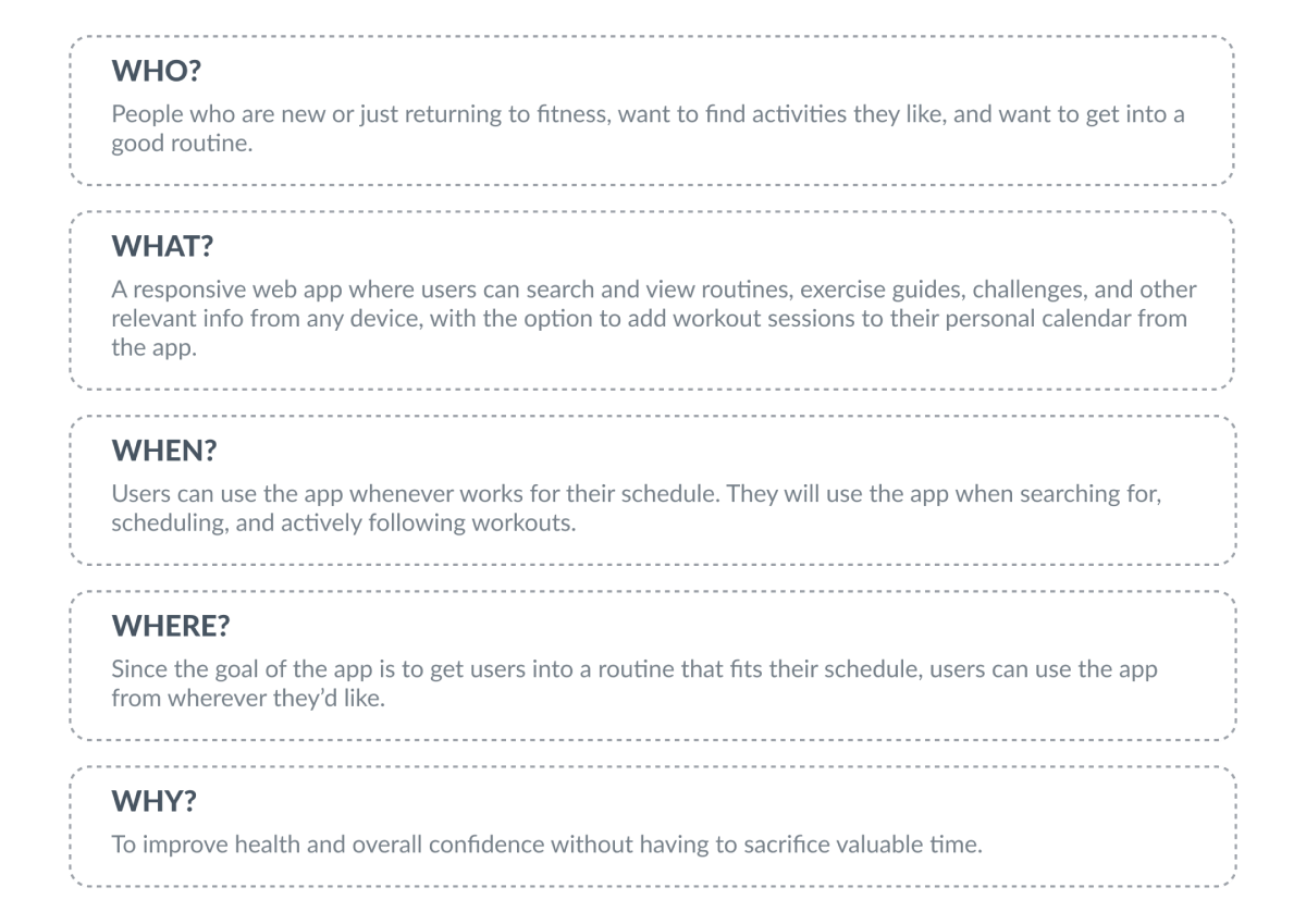
To begin, I would need to start with the 5 W-questions to define the scope of the project:
Empathize
Who is the User?
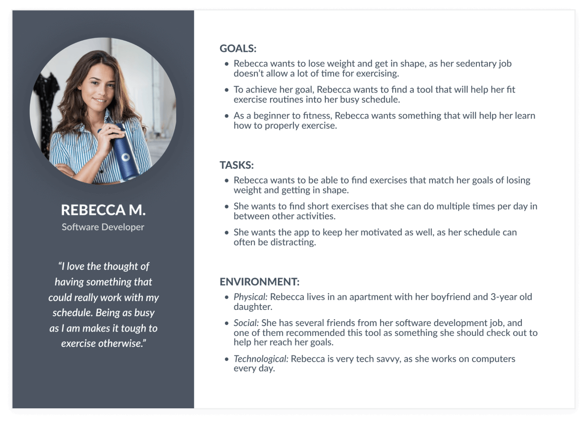
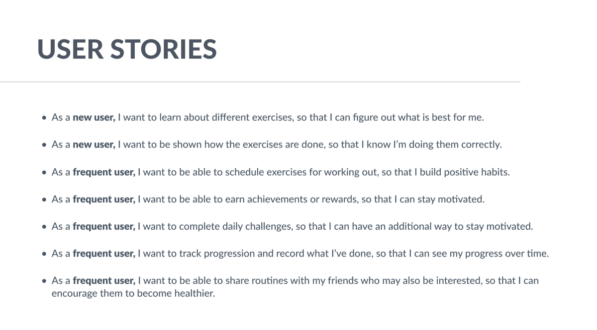
The project brief provided the following proto-persona and user stories, which helped me to better understand my target audience and their needs, motivations, and pain points, which, as I knew from the wider UX lens, would help to inform my design.
Ideate
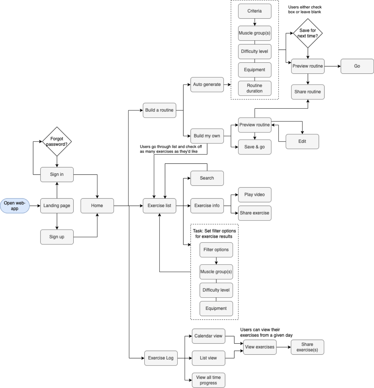
Given the essential features and the above user stories provided by the project brief, I created a user flow diagram to better visualize the screens that would be needed within the app in order to help users achieve their goals.
Design
Low-Fidelity
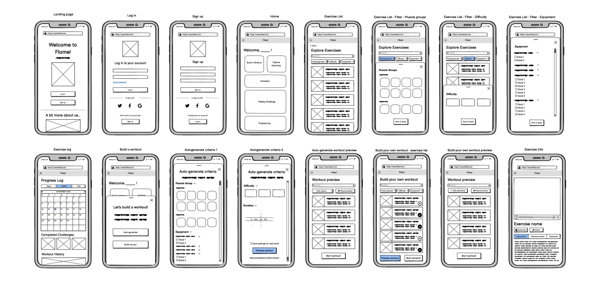
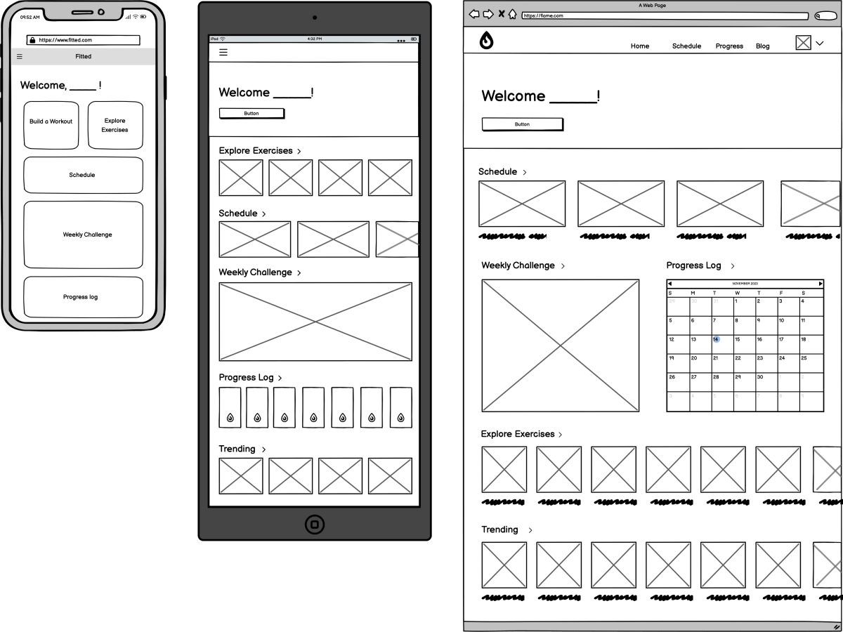
Next, I used Balsamiq to create low-fidelity wireframes and prototypes to quickly map out the main functions of the app. I designed with a mobile-first approach, expanding to larger breakpoints once I had established my basic mobile designs.
Mobile Wireframes
Expanding to Larger Breakpoints
Mid-Fidelity
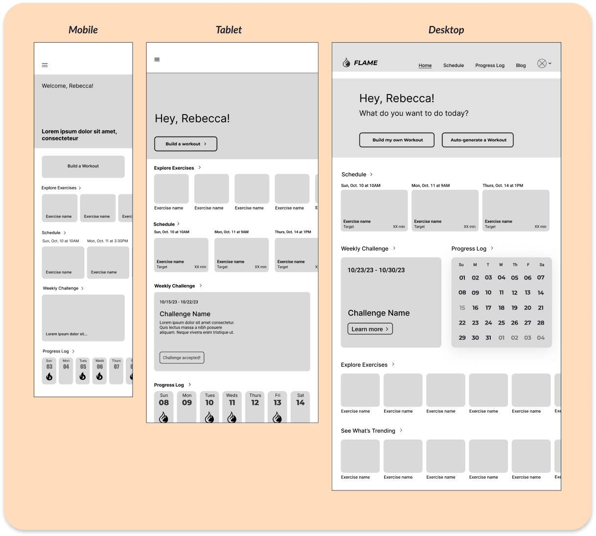
It was time to start translating my low-fidelity designs into mid-fidelity wireframes in order to btegin breathing some life into the app. At this point, I established my typographic styles, added some basic UI elements to my screens, and used common UI design patterns to inform the overall form and function of the app.

High-Fidelity
Now it was time to move on to the high-fidelity phase and truly bring my designs to life! The journey to high-fidelity would involve creating a mood board, refining my design elements, and establishing a style guide in order to create an engaging visual design that would showcase and further enhance the app's brand identity.
Mood Board
In order to set the tone and overall aesthetic of the app, I gathered my ideas visually with a mood board.

Style Guide
I then created a visual style guide to establish consistency in my design from screen to screen, further strengthening the app's brand and overall look and feel.

Click below to see the full style guide:
Flame Style GuideThe Outcome

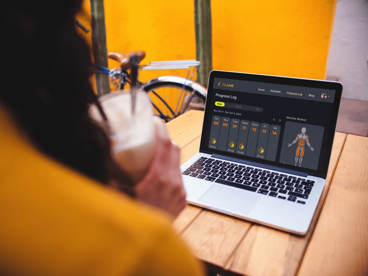


Prototype
Flame Interface in Action
Check out the brief video demo videos below to see Flame in action!
Learnings & Future Directions
Crafting Flame's UI from scratch for this course project has been an incredibly valuable and enriching experience for me, not to mention a lot of fun! As I navigated the delicate balance between visual aesthetics and functionality, I learned how clear communication and engaging visuals come together to shape the overall user experience of a product.
While my knowledge of UX design certainly informed the creation of Flame, given the project's primary focus on UI development, there's an opportunity to more deeply analyze Flame from a UX perspective in the future.
Specifically, I'd like to conduct user testing with Flame to validate the designs and overall concept at the current stage of development. This step will help provide valuable insights, ensuring that the UX and UI work together to create a smooth, satisfying, and widely accessible experience for all users.
Next Steps
- Conduct first round of usability testing to validate current designs and identify any areas of improvement.
- Iterate on designs based on user feedback.
- Match & expand functionality on both Tablet and Desktop breakpoints.