Mentr Case Study
Project Overview
Mentr connects users to trusted experts around the world, around the clock.
As the main focus of my comprehensive UX Immersion bootcamp, Mentr is an app that aims to revolutionize learning by connecting users with knowledgable experts across diverse fields, offering real-time insights and trusted advice.
Explore how I harnessed user-centered design principles to craft a seamless experience that fosters learning, empowers collaboration, and champions inclusivity. Dive into the design thinking, challenges, and solutions that shaped Mentr into a dynamic space for learning and connection.
Context
In our current digital age, information is always at our fingertips. However, discerning what's credible and what's not is a continuously evolving challenge for users amidst the ever- growing mountain of data and information.
Problem
Users need a way to get trusted answers to any question or problem, big or small, across a wide range of topics from credible sources, because they want quick, accurate, and evidence-based information.
Solution
We will know this to be true when users come to Mentr to seek out answers to questions across a variety of topics and consistently return to the app to seek advice about subjects beyond their scope of knowledge.
The Design Process
Understand & Define
Competitor Research
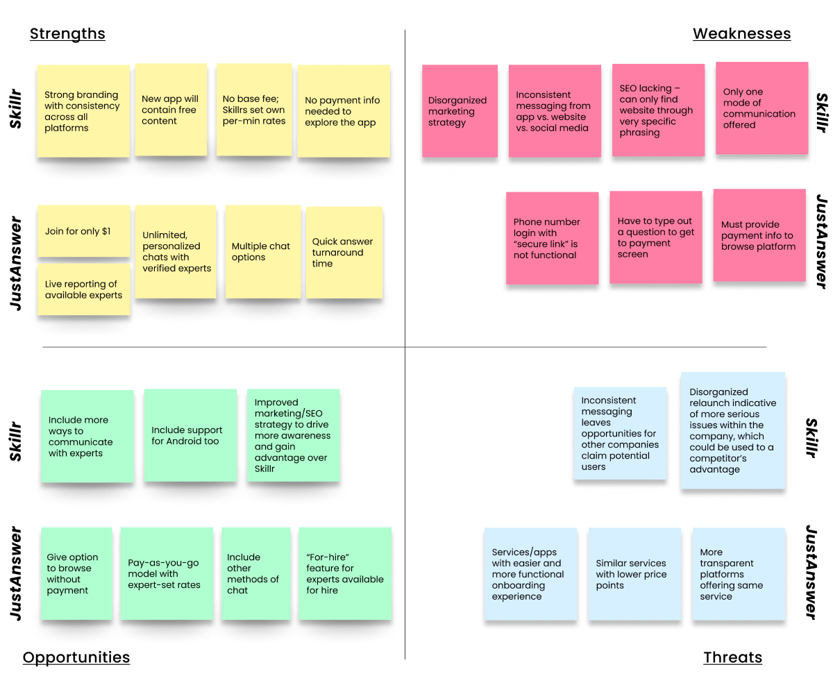
To better understand the problem space in which I would be working, and to identify opportunities as a new app within this space, I performed a competitive analysis for two competitors in the ask-an-expert market.
Conclusions:
Mentr can stand apart from market competition by offering the following:
- Individualized 1-on-1 sessions, focusing on the potential to form ongoing mentor-mentee relationships.
- A way to verify expertise.
- A modernized and transparent platform/interface across devices.
- Personalized features to enhance and expand engagement.
User Research
After researching and defining the competition space, next step was to understand the audience I would be designing for.
To do so, I would need to conduct surveys and interviews with real potential users, which would help me in creating user personas to further inform my design.
Research Goals
1. Determine confidence
- Determine how confident users are in finding trustworthy and credible information with the current tools available.
2. Define "expertise"
- Understand how users define "expertise," and criteria needed to trust a source.
3. Understand context
- Understand the context of use.
- Determine the most useful vs. least useful features.
User Surveys
I built an online survey consisting of a mix of 11 open-ended and multiple choice questions. Through the 33 responses I received, I gained insight into the following about my users.
- Target demographics
- Previous experience with ask-an-expert type services
- Factors contributing to perceived "expertise"
User Interviews
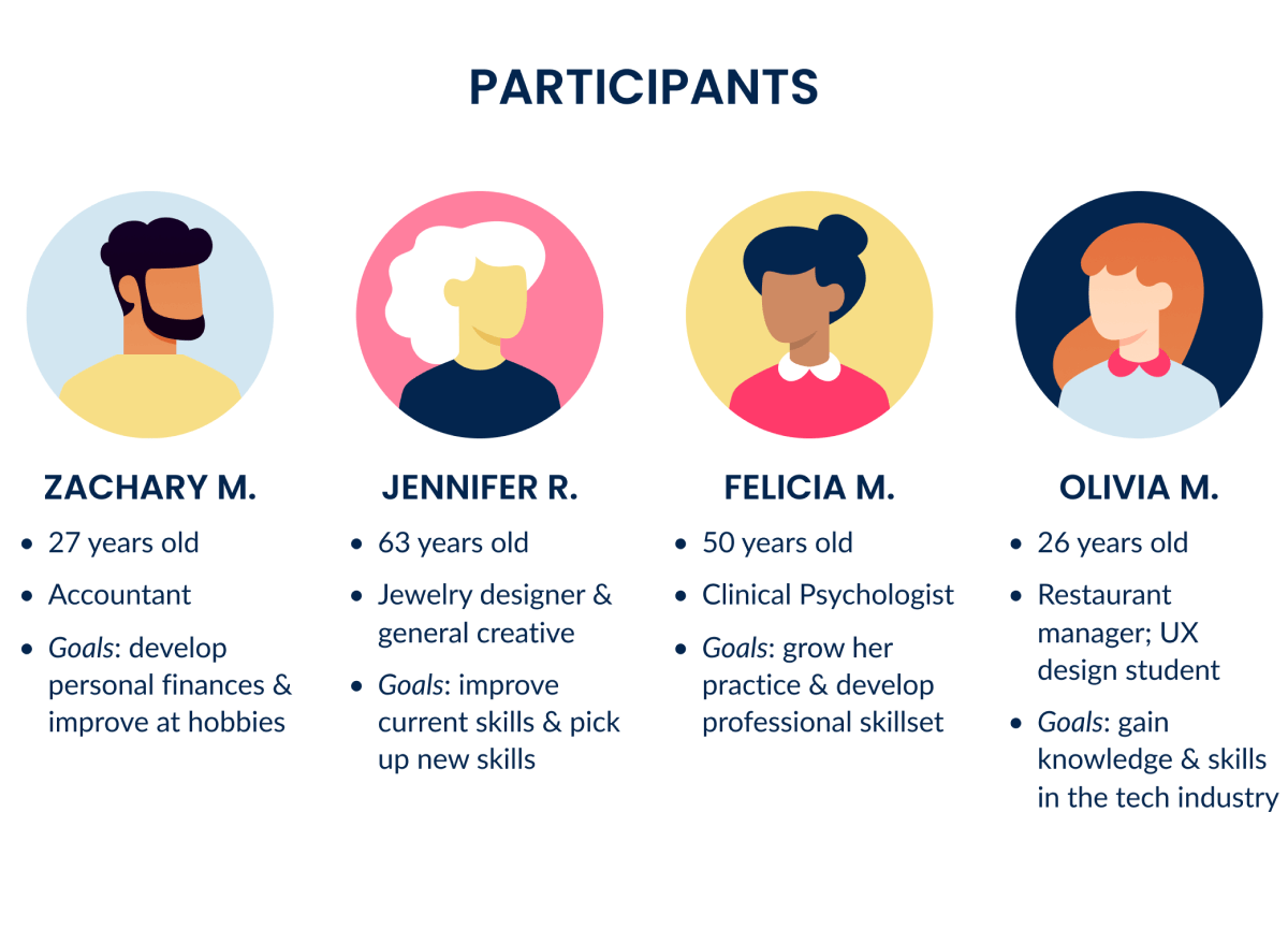
I then conducted more in-depth user interviews with 4 participants to gain additional insight into what I had learned from my survey.
Interviews consisted of 10 questions and spanned about 20-30 minutes each.
Results were aggregated, organized, and analyzed to make sense of the findings.
Analyzing the Data
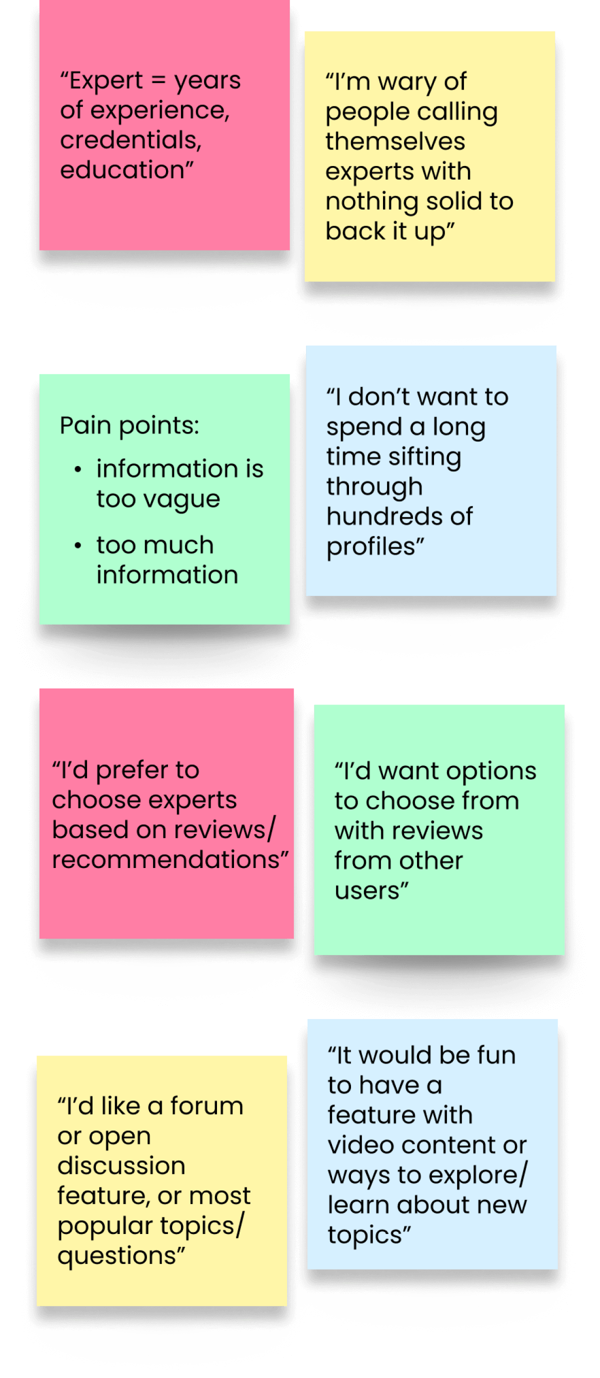
Through affinity mapping, I sorted through my data points, looking for common themes, pain points, and feelings from which I drew the following key insights:
1. Experience + Qualifications = Expertise
- Verifying expertise is crucial to establishing credibility.
2. Too many options = Choice paralysis
- Choice paralysis impedes decision-making. Effective filters can help to reduce cognitive load.
3. Reviews are valuable
- Users value reviews & recommendations from other users to aid in decision-making.
4. Give opportunities to explore & discover
- Users appreciate opportunities to learn about new topics and discover new interests through personalized content suggestions and discussion platforms
For a closer look at my affinity map, click here!
Empathizing with the User
User Personas
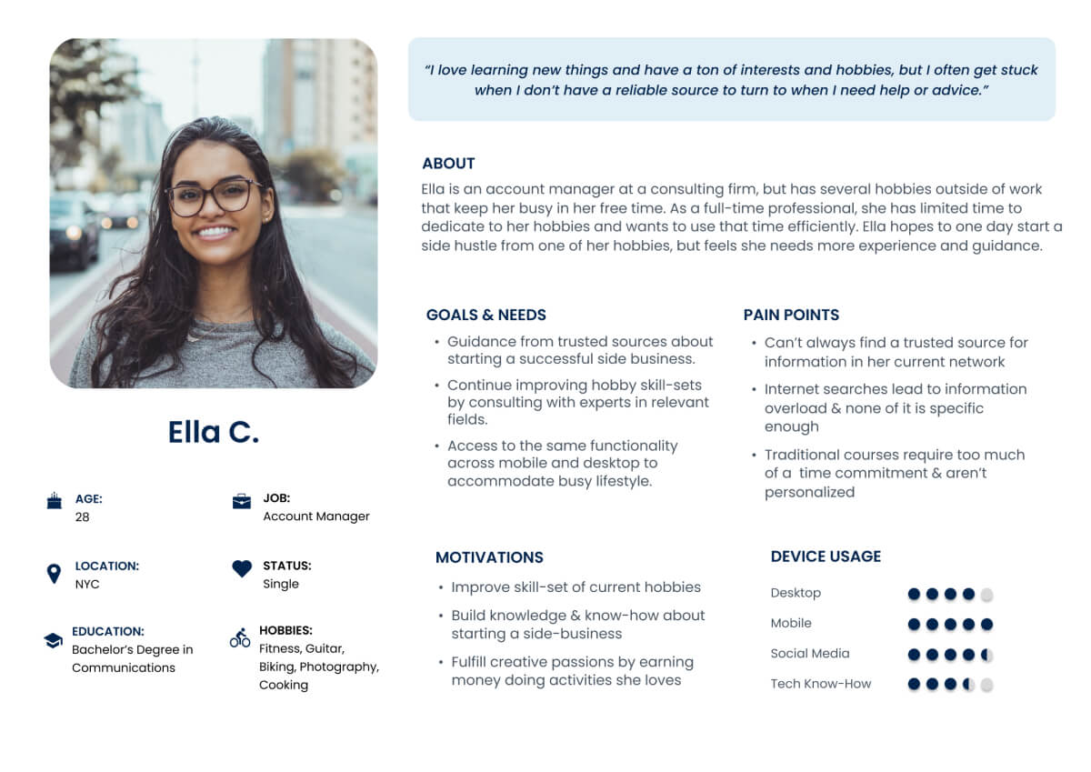
In order to form a deeper understanding of my users' goals, needs, experiences, and behaviors, I used the data points and key insights from my user research to develop a representative user persona.
Meet our persona, Ella, who has guided me throughout the design process, reminding me to keep my users at the forefront of every decision along the way.
Ideation
User Journey
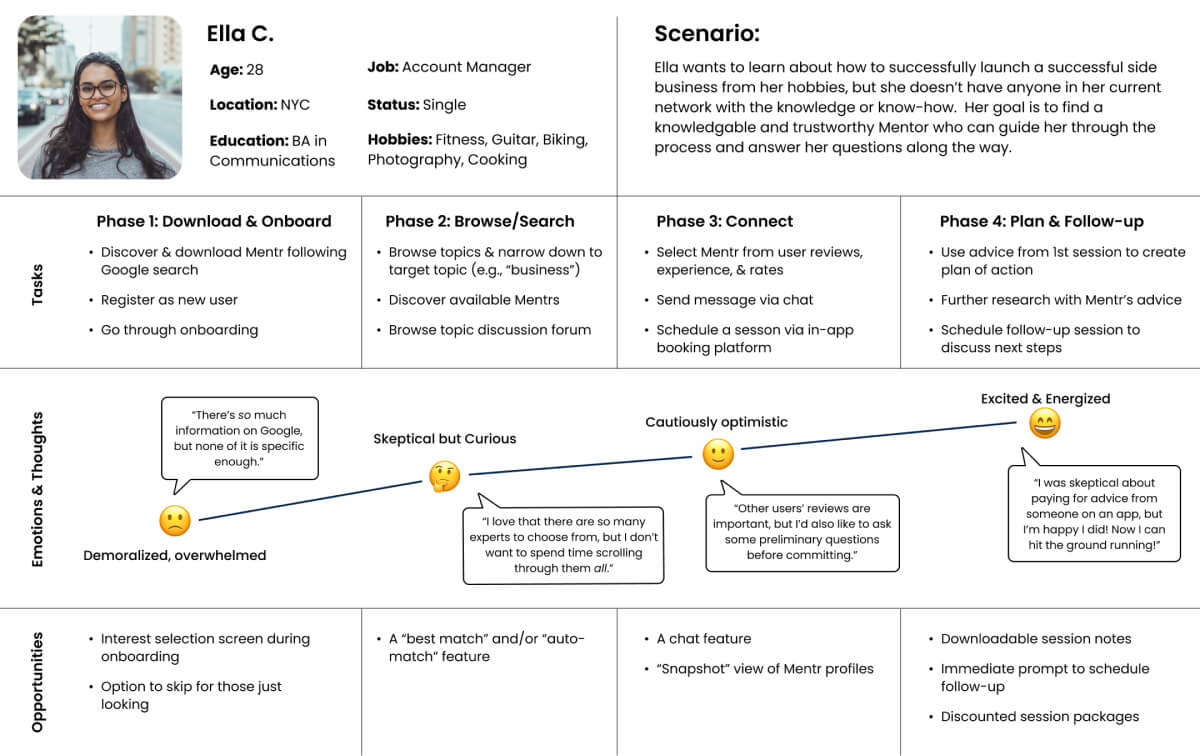
Using what I knew about Ella's goals, pain points, and motivations, I created a user journey map to better visualize the process of how Ella would accomplish her goals using the Mentr app.
User Flows
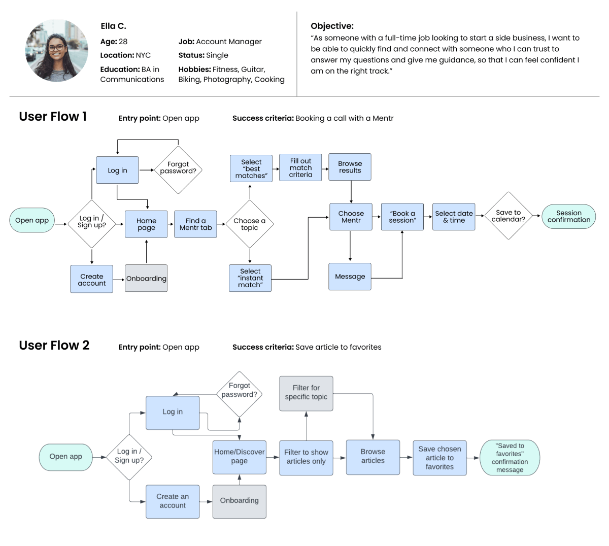
After mapping out Ella's journey, I began to think more about the specifics of how this journey would play out within the app itself. By creating different user flows to visualize different tasks Ella may want to accomplish, I was able to ensure each task flow was as efficient as it could be and that any obvious/unnecessary obstacles were addressed before moving forward in the design process.
Initial Sitemap & Card Sorting
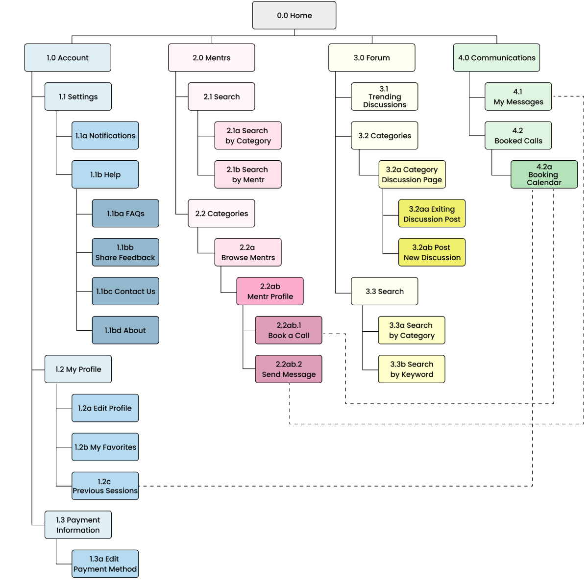
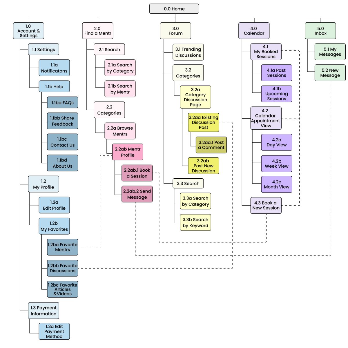
Using my user flows, I created an initial sitemap to help visualize how the information architecture of Mentr would look. Initially, I had sorted all of my potential screens into 4 main categories, but I would need to confirm with potential users that this structure made sense.
So, in order to collect feedback about my information architecture, I conducted open card sort with 6 participants in which they sorted 28 cards into their own categories.
Findings
The card sort revealed the following:
- Participants created a total of 37 categories, with a median of 5 categories each
- 50% of participants created 5 categories
- 17% of participants created 6 categories
- 17% of participants created 7 categories
- 17% of participants created 9 categories
It was clear from the card sort that most users felt my information architecture should span at least 5 categories, rather than the 4 I had initially mapped out. Using that information, I then revised my sitemap accordingly.
Click here to read about my card sort in more detail.
Revised Sitemap
In addition to increasing my categories from 4 to 5, I also made a few more minor revisions based on the results of the card sort:
- "Mentrs" category name changed to "Find a Mentr" for increased clarity
- Expanded "My Favorites" section
- "Past Sessions" moved from "My Profile" to "Calendar" under "My Booked Sessions"
Wireframing & Prototyping
Low-Fidelity Wireframes
Now that I had the basic structure of Mentr down, it was time to translate my sitemap into low-fidelity wireframes to quickly get some ideas on paper (or in this case, iPad Pro). I kept my sketches high-level and big picture in order to avoid getting hung up on details too early on in the process.
Take a look below at some early sketches of the Dashboard, Find a Mentr page, and Calendar (shown left to right).

Mid-Fidelity Wireframes & Prototype
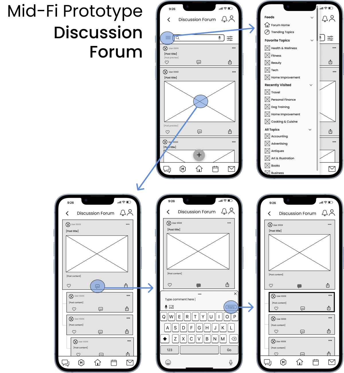
After getting some initial ideas down and choosing the most viable of the bunch, it was time to move over to Figma to begin translating those sketches into a functional mid-fidelity prototype. I started out with 3 main features: Favorites, Review a Mentr, and the Discussion Forum.
Check out the gallery below for a better look!


Testing & Iterating
Usability Testing
Now that my clickable mid-fidelity prototype was up and running, it was time to start testing my designs with some real users!

Testing Goals
- Determine how easily/quickly users learn to navigate Mentr and understand how to use its core functions.
- Identify any prominent pain points and/or opportunities for improvement as users perform tasks.
Testing Details
- Participants: 6 participants who met the criteria Mentr's target audience.
- Methods: Moderated remote study sessions using Google Meets; recorded with consent of participants.
- Tasks: Brief introduction explaining the purpose of the session, usability test tasks, and a debrief at the end.
Findings: Issues & Solutions
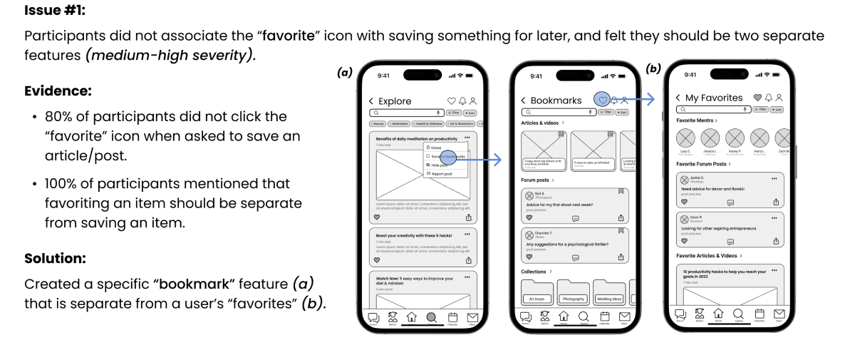
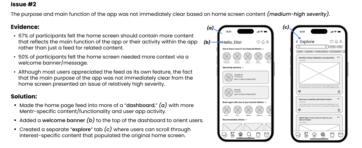
Analysis of my usability test data via affinity mapping and use of a rainbow spreadsheet revealed that I would need to make some major changes to my information architecture and overall organization of Mentr. Additionally, data suggested that I would need to make some other minor changes to iconography and terminology to improve the clarity of certain features within the app, and to reduce the cognitive load on the user as they're learning to navigate the app for the first time.
Check out my top 2 highest priority issues below, and the changes I made to fix them.
UI & Visual Design
Once the major usability issues were resolved, it was time to begin designing the final high-fidelity screens in Figma.
However, I wanted to first establish what type of "look and feel" users preferred from the get-go. This way, I would have a solid starting point based on user feedback before designing the rest of Mentr's screens. This would also prevent me from having to re-design the whole app's UI later on if it turned out that users didn't like my choices.
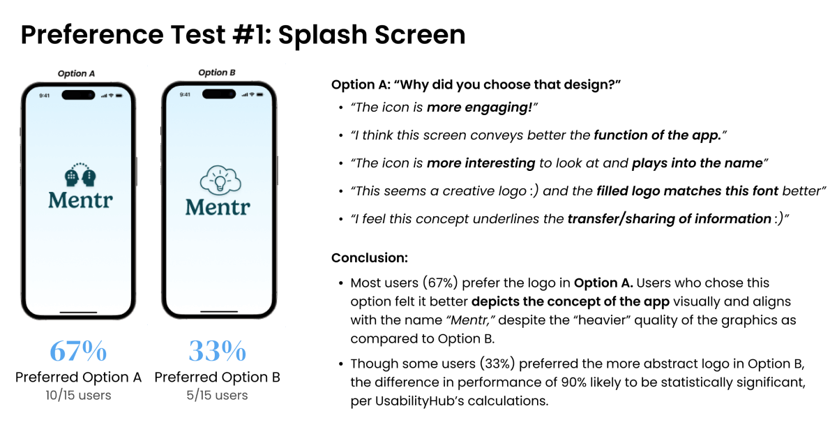
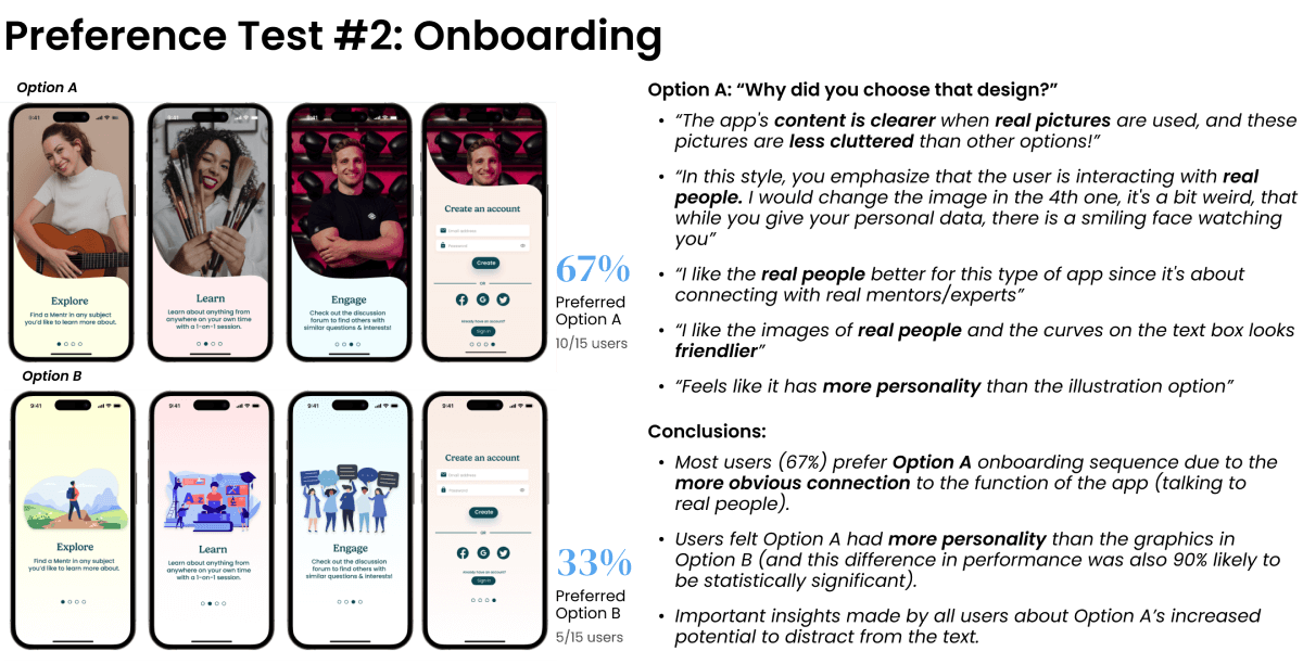
Preference Testing
I began by creating 2 hi-fi versions of both the splash screen and onboarding sequence, and then ran 2 preference tests virtually via UsabilityHub to determine which designs users preferred and why. Each preference test was conducted with 15 participants.
Take a look at the results below!
Developing a Design Language System
After performing my preference tests and receiving feedback, I now had a strong foundation to build upon as I designed the high-fidelity versions of the rest of my screens.
As I learned more about the principles of UI design, I continued to improve upon my UI elements accordingly. Throughout this process, I developed a color palette based on principles of emotional design, made changes to my UI elements based on best practices and guidelines from established design systems (e.g., Material Design), and ultimately created a design language for Mentr, which I've continued to add to and improve upon as my designs have evolved.

Check out the full design system by clicking the button below!
Mentr Design SystemHigh-Fidelity Prototype & Collaboration
As my high-fidelity screens and overall design system continued to evolve, I wanted to ensure I had at least one other set of eyes to look over my designs and provide feedback from a different perspective than my own. I posted my design to a community of other UX design students via Slack and had 5 other students provide feedback on my designs in exchange for feedback on their designs.
This design collaboration and peer review process was integral in identifying issues I had essentially gone "blind" to as the sole designer of Mentr and in taking the necessary steps to correct them.
However, while this exercise was certainly helpful in collecting feedback to implement from other designers, it was also incredibly valuable for me in learning to defend my design decisions for the feedback I chose not to implement.
Below you'll find some of the design decisions I made, and more importantly, why.
Accepted Feedback & Revisions
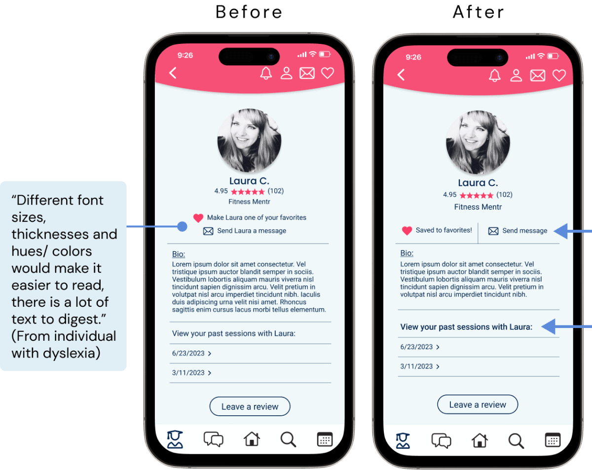
Revisions
- Changed layout of profile page to reduce amount of text for functions.
- Created more defined sections with more white space to reduce initial visual overload.
- Increased text weight of section header for more visual definition.
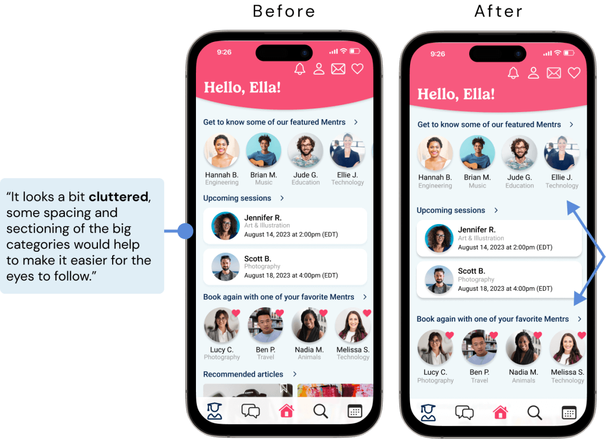
Revisions
- Increased spacing between sections to decrease visual clutter on first glance.
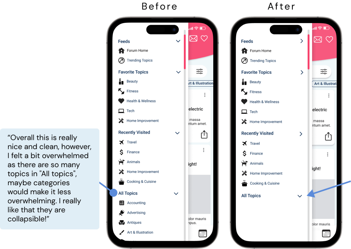
Revisions
- Made the "All Topics" section of slide out menu collapsed by default, allowing user to expand it by choice.
Rejected Feedback & Rationale
Rationale
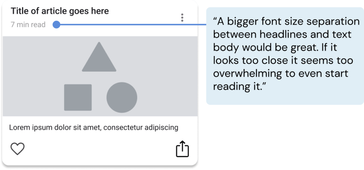
- The WCAG suggests a minimum line height of 1.5dp, and the spacing between this title and subheader is 7dp.
- Additionally, the difference in color/weight between header and subheader puts emphasis on title text.
Rationale
- This is a relatively straightforward and commonly used icon to indicate a comment function.
- Additionally, its function is revealed once a user taps on it (keyboard appears), so a tool-tip would likely feel redundant.

Rationale
- The FAB (floating action button) is clearly a new addition to the screen upon navigating to the Forum page (it is not present on any other page).
- The FAB is also not housed within the navigation bar, and has a drop shadow to further visually differentiate it from the nav bar icons.
- Furthermore, a tool tip will be added to explain the function of this button, which will also help clarify any confusion.

Designing for Accessibility
With a background in the field of medical rehabilitation prior to my training in UX design, I've learned how important accessibility is for both the physical and digital products we use in everyday life.
In this section of the course, I began to familiarize myself with the Web Content Accessibility Guidelines (WCAG) and discovered the ways in which my current design could be improved to meet those standards. Take a look at some of the preliminary changes I made to improve the inclusivity of my designs.
Future directions for Mentr will involve a much deeper analysis of accessibility standards and with it, more complex improvements.
Updates
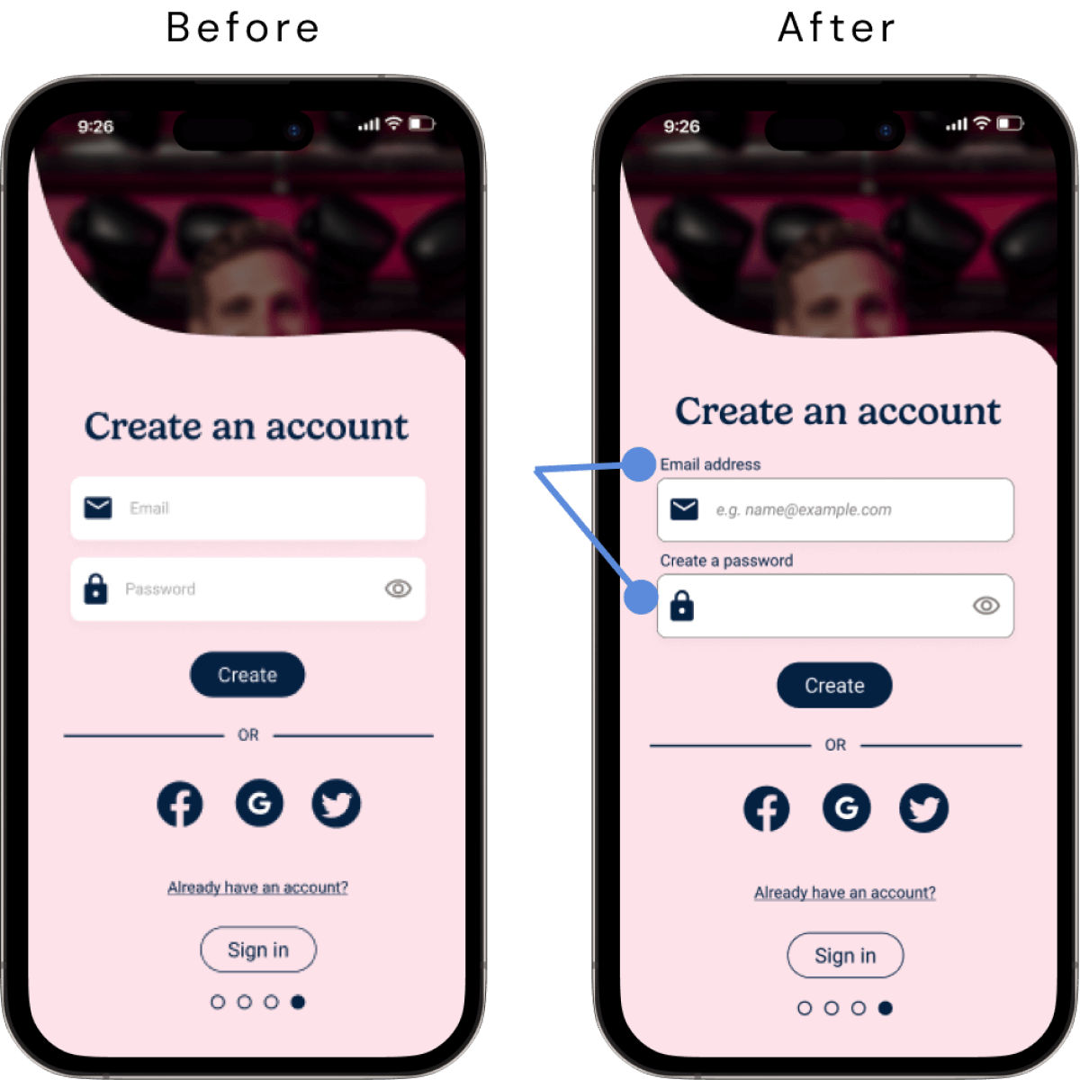
- Replaced placeholder text within text field with permanent labels above text field so that the informative text does not disappear once a user goes to type in the text field; used placeholder text only as supplemental example text for users to refer to.
- Added a darker stroke around text fields to increase contrast of element against background color in order to improve visibility of text fields.
Updates
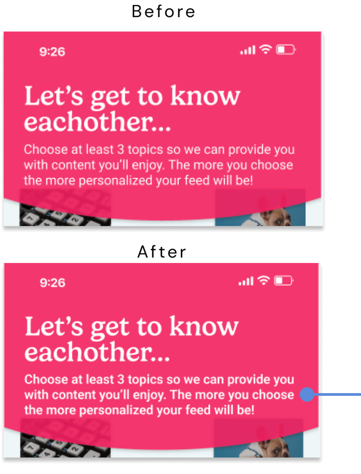
- Increased weight of body text in header to semi-bold (at 16pt size) to achieve definition of "large" text (14pt and bold or larger, or 18pt or larger), which passes WCAG AA standards for contrast of body text against background.
Updates
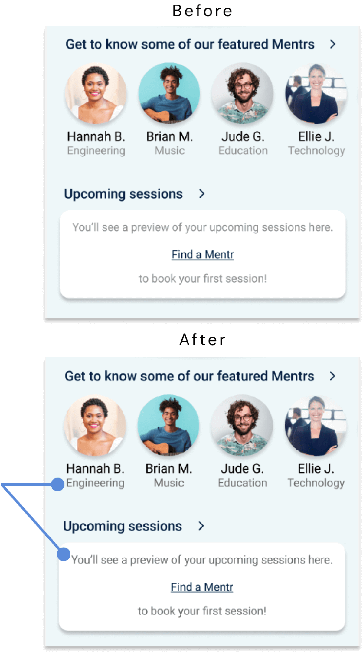
- Darkened secondary text color from #9B9B9B (which did not pass WCAG contrast criteria) to #757575, which meets WCAG AA standards for normal text and large text, and WCAG AAA for large text.
High-Fidelity Clickable Prototype
Click below to experience the full Mentr prototype for yourself in Figma!
Experience Mentr here!Future Directions
While I've spent the better part of a year learning the principles of UX design and how to apply them in the creation of my own app design, my work on Mentr is far from finished.
As a designer, I am always striving to improve my designs as I continue to learn and grow my knowledge and skill-set within the field. With that, I've created a list of next steps for Mentr should I have the time and resources to invest in the future:
1. Design & Refine
- Finish designing all secondary screens and user flows.
- Design higher-level features and expand accessibility enhancements.
- Refine and polish the design.
2. Test & Analyze
- Run second round of user testing aimed at refining higher-level aspects (e.g., UI/ aesthetics, micro-interactions & animations, accessibility).
- Analyze results and organize into meaningful data points.
3. Implement
- Implement changes from second round of user testing.
- Integrate revisions and any additions into high-fidelity prototype.
4. Expand
- Using all that I've learned from creating Mentr, expand the concept to create a counterpart app for Mentrs themselves.
Learnings & Reflections
Designing Mentr from the ground up has been beyond valuable in my development and growth as newcomer to the field of UX design. Throughout this journey, I've learned the intricate dance between user needs and innovative solutions, the art of balancing aesthetics with functionality, and above all, the paramount importance of empathy in good design.
These lessons and skills I've gained through the creation of Mentr will serve as a solid foundation to build upon as I continue to learn and gain experience as a UX designer.